Umoja 30
DESIGN (IDENTITY, COMMUNICATIONS, EXHIBITION, editorial AND SWAG)The Umoja House was born from student activism—from the need for more diversity and inclusion on campus. It was established in 1989 as a residence where students of colour could express themselves, and has since evolved into a residential community that embraces all manners of diversity. I designed materials across media for Umoja House’s 30 year anniversary celebration. From a personal standpoint, it’s been immensely fulfilling to work alongside a group of people who care as deeply about community as the team working on this celebration does.
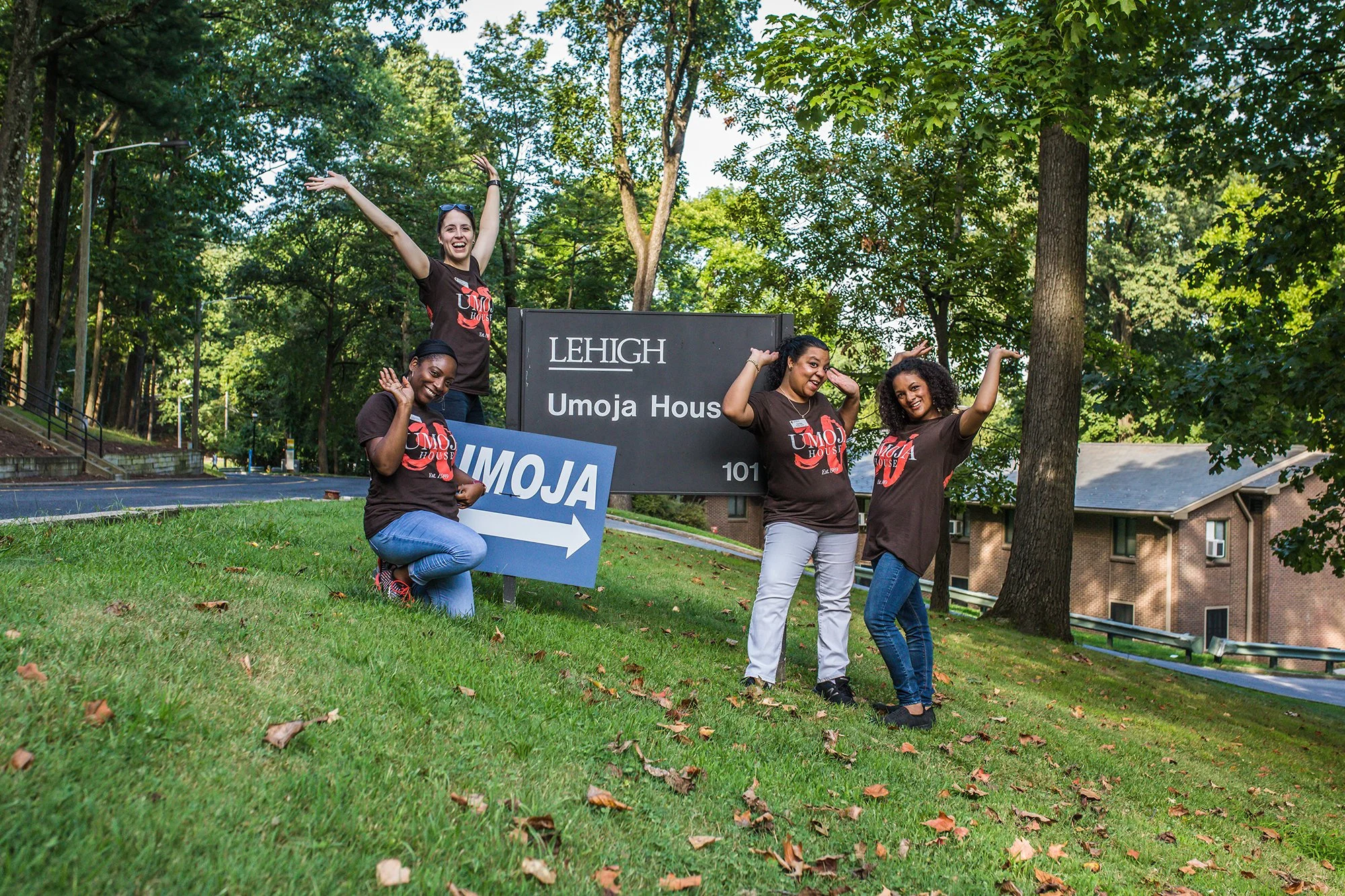
Photography: Christa Neu

My goal was to create a wordmark that felt like a subset of the Lehigh University identity, while giving the celebration its own personality.
Colours and the classical serif typeface from the university's visual identity ground the mark in 'Lehigh', while composition and the display typeface make it feel hand-made and approachable.


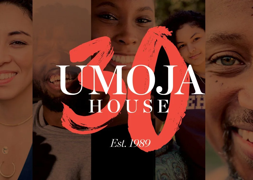


Portrait gallery: I designed a gallery of stunning portraiture captured by photographer Christa Neu. This included planning the space, test-printing on various substrates and installing the exhibit—all on a tight budget!

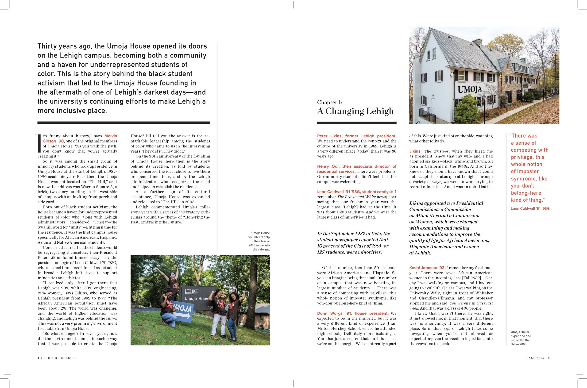
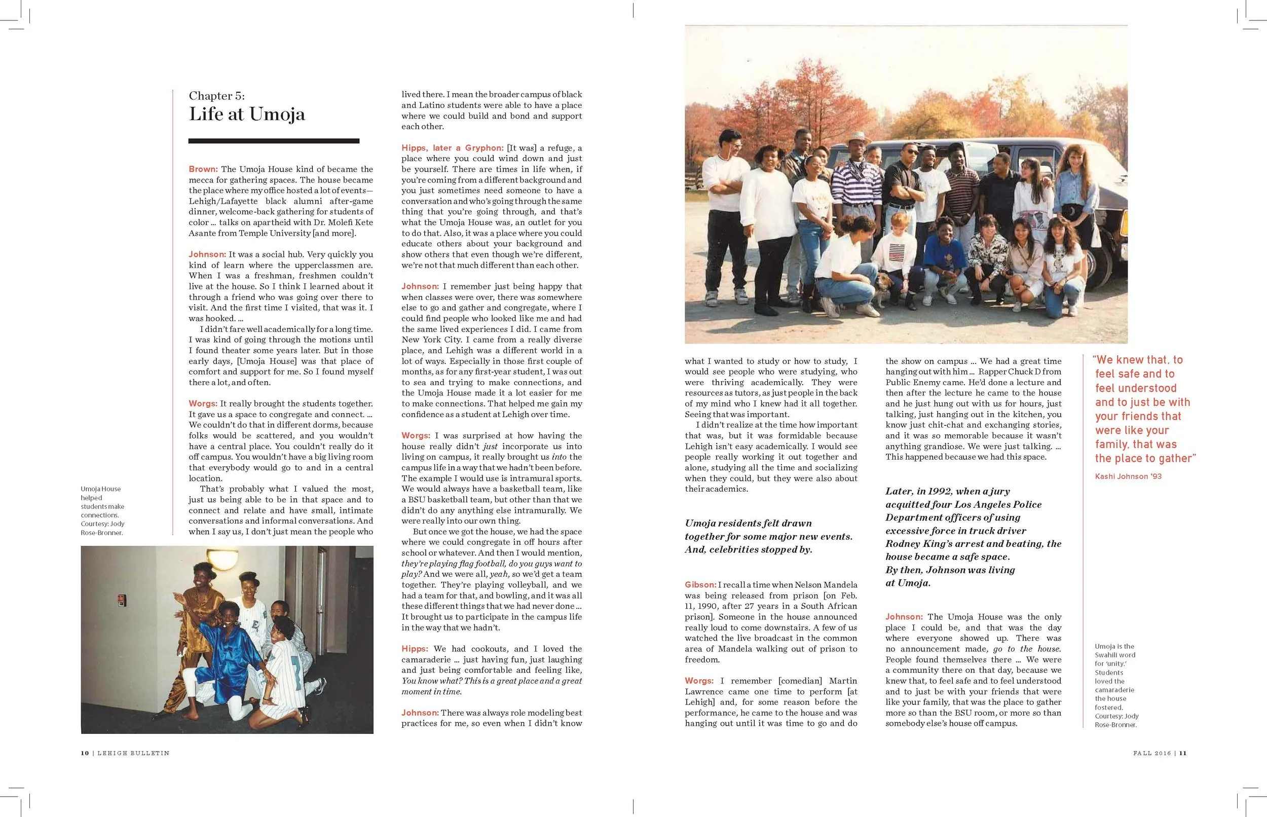
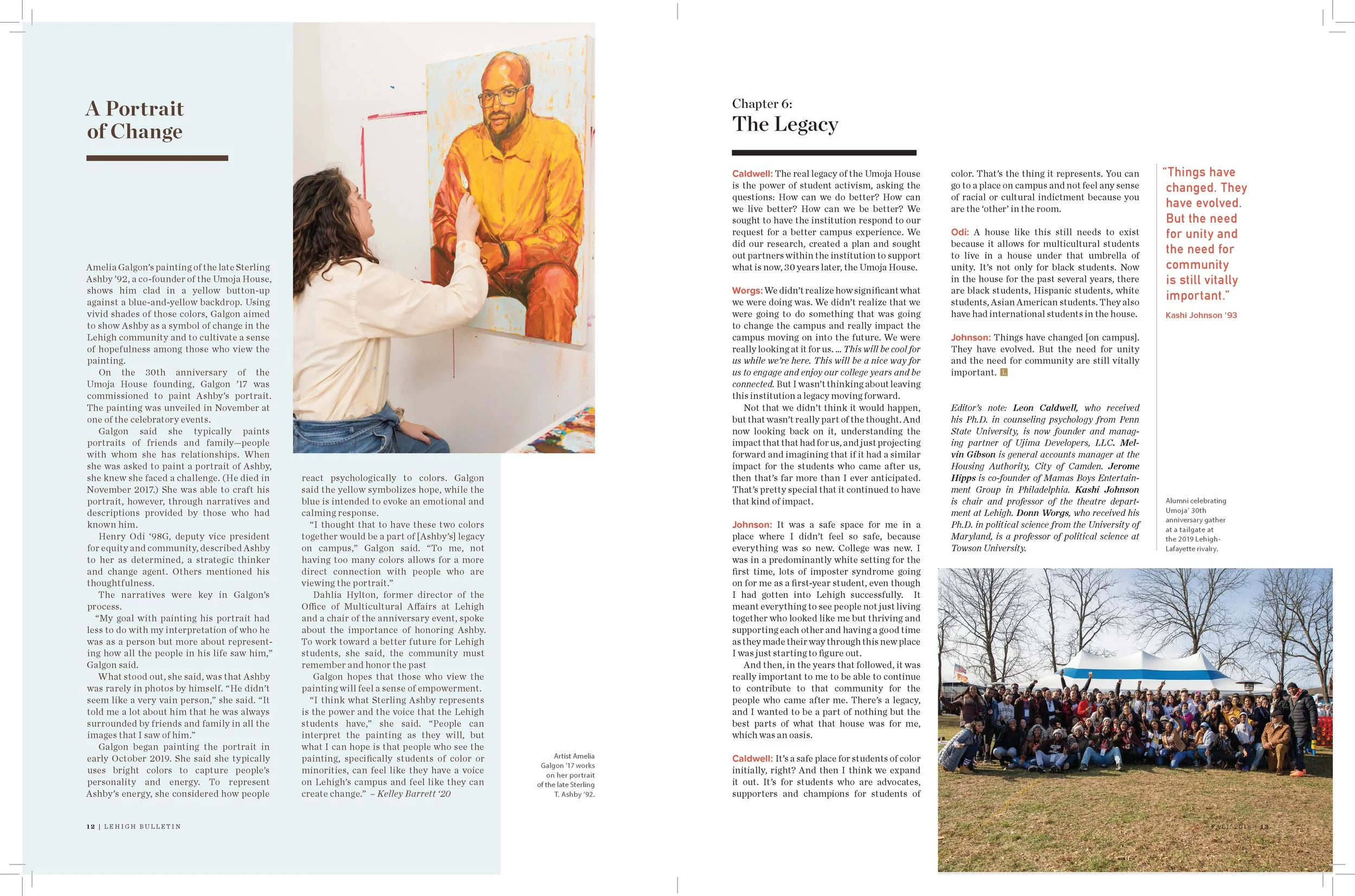
Editorial: To celebrate its 30th anniversary, Lehigh published a long-form editorial feature about the founding of the Umoja House. I designed both the print and web versions.



My Role
Identity ,communications (print and web), exhibition, editorial and swag design, and project management.